

EdTech
Universe Camp — Chess Leader


Redisigning themed summer camp to bring out emotions and build trust.
Overview
As Chess Leader's first in-house designer, I owned the project end-to-end: research, design system, UI, and handoff — alongside daily graphic design responsibilities.
Problem
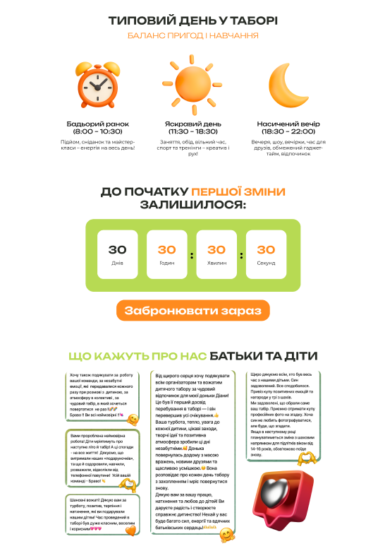
I discovered that the existing site wasn't converting: visually flat, hard to navigate, and a booking form that gave the sales team too little to work with. Users left early resulting in lost leads.
Research
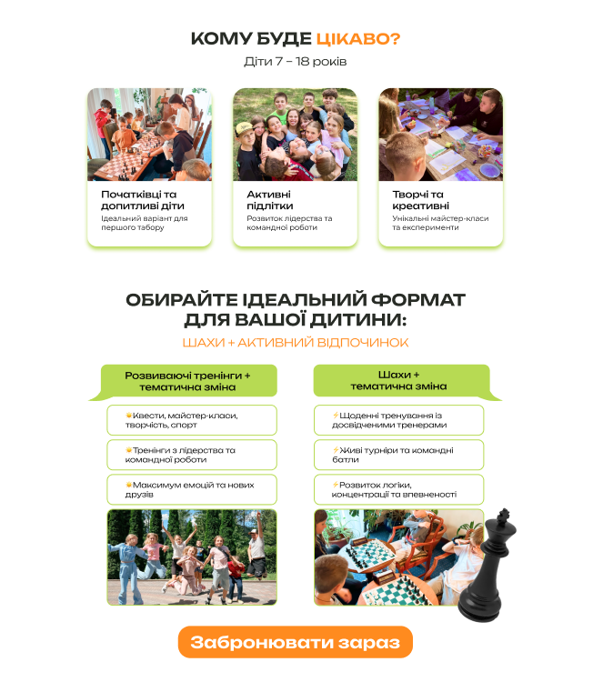
Analysed competitors and interviewed users. Key finding: fast access to contacts and frictionless section navigation were critical — especially for parents browsing after work.
Key Decisions & Why
Floating mobile nav over hamburger menu — users struggled to return to specific sections. A persistent nav solved it without adding page weight.
3D icon system over animation — leadership wanted hero animations. I pushed back: animation would slow load time without lifting conversions. A cohesive 3D icon set added visual energy at zero performance cost.
Real photos + structured content over illustrations — colour-graded photography built trust with parents; clear information hierarchy made key details easy to scan and act on.
Results
· Full design system + high-fidelity designs for landing page and 3 session pages — delivered in 2 weeks
· Site launched and received first bookings
· Team confirmed the redesign stands out among competitors
· Expanded form fields streamlined lead qualification for the sales team
.png)
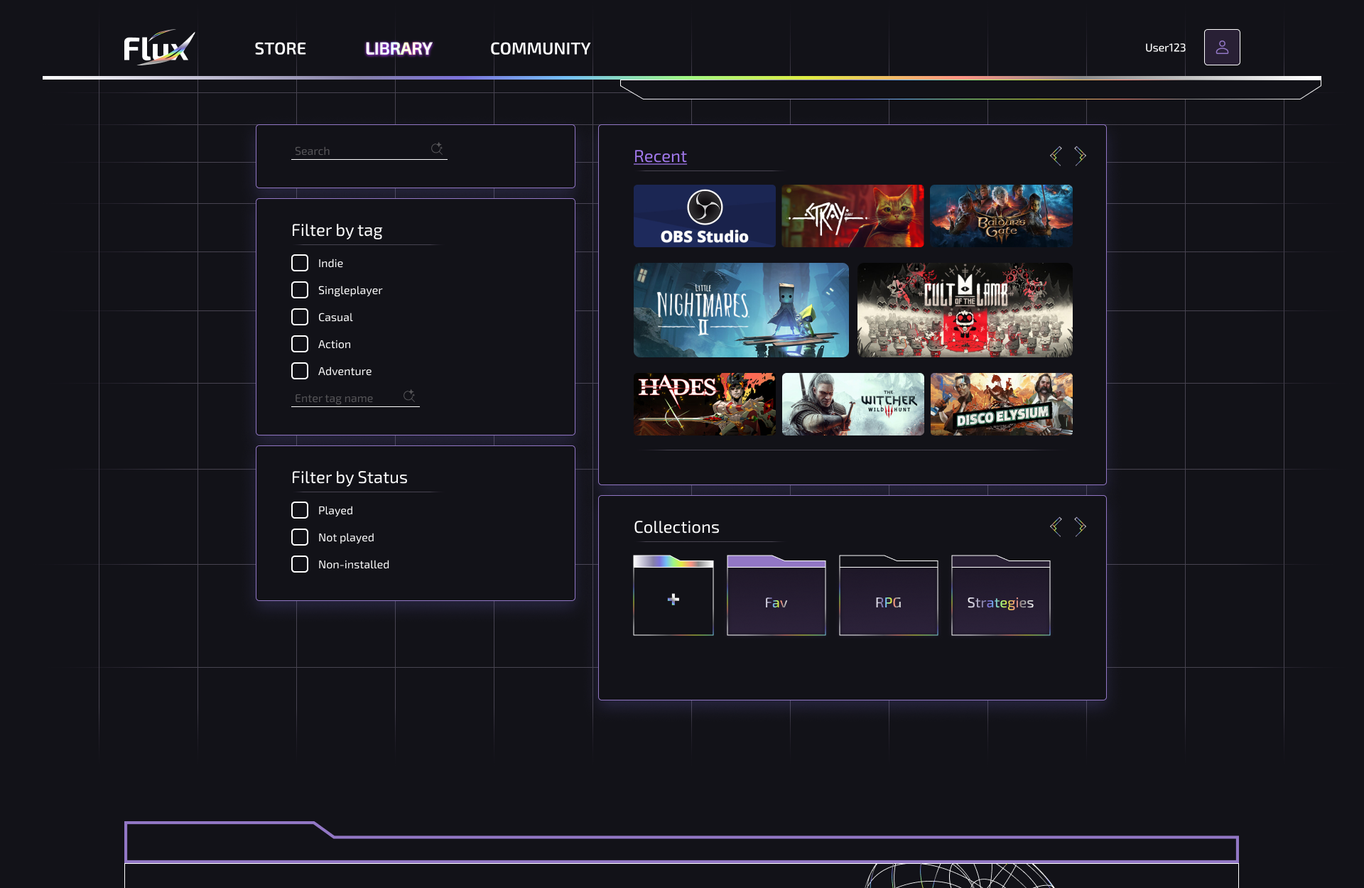
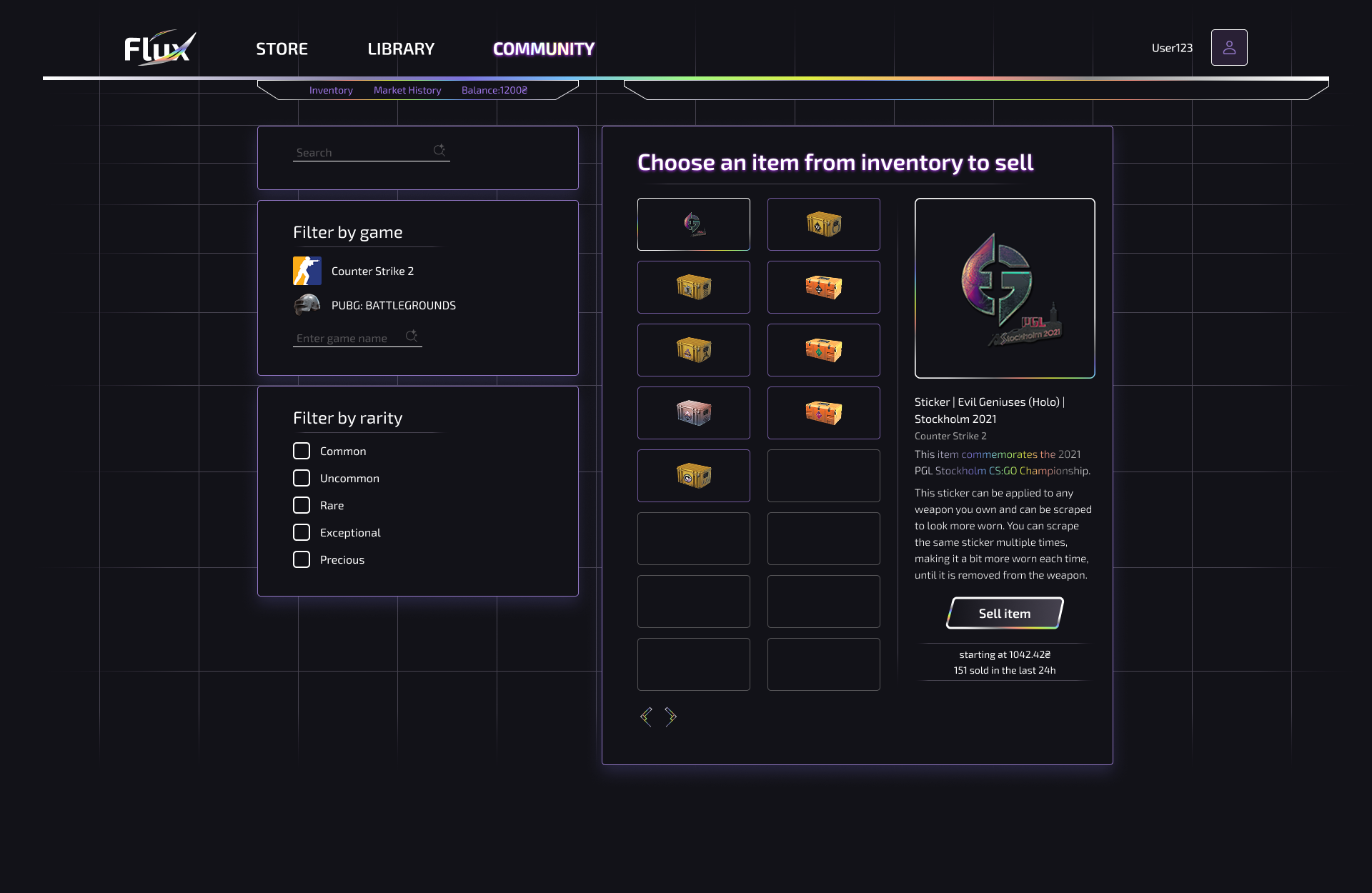
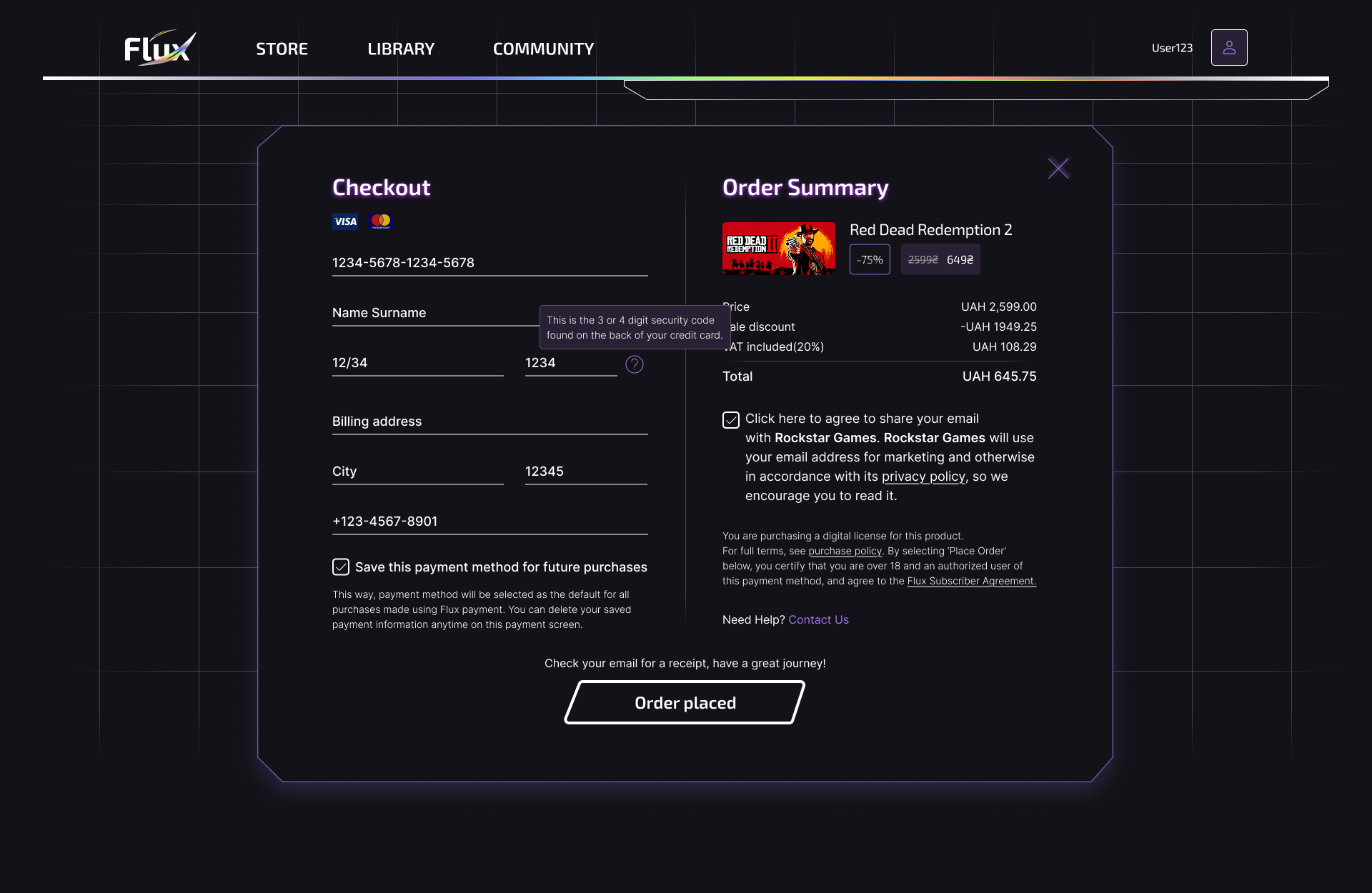
Gaming platform
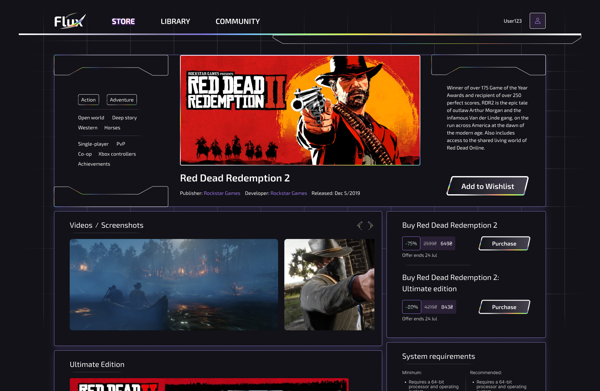
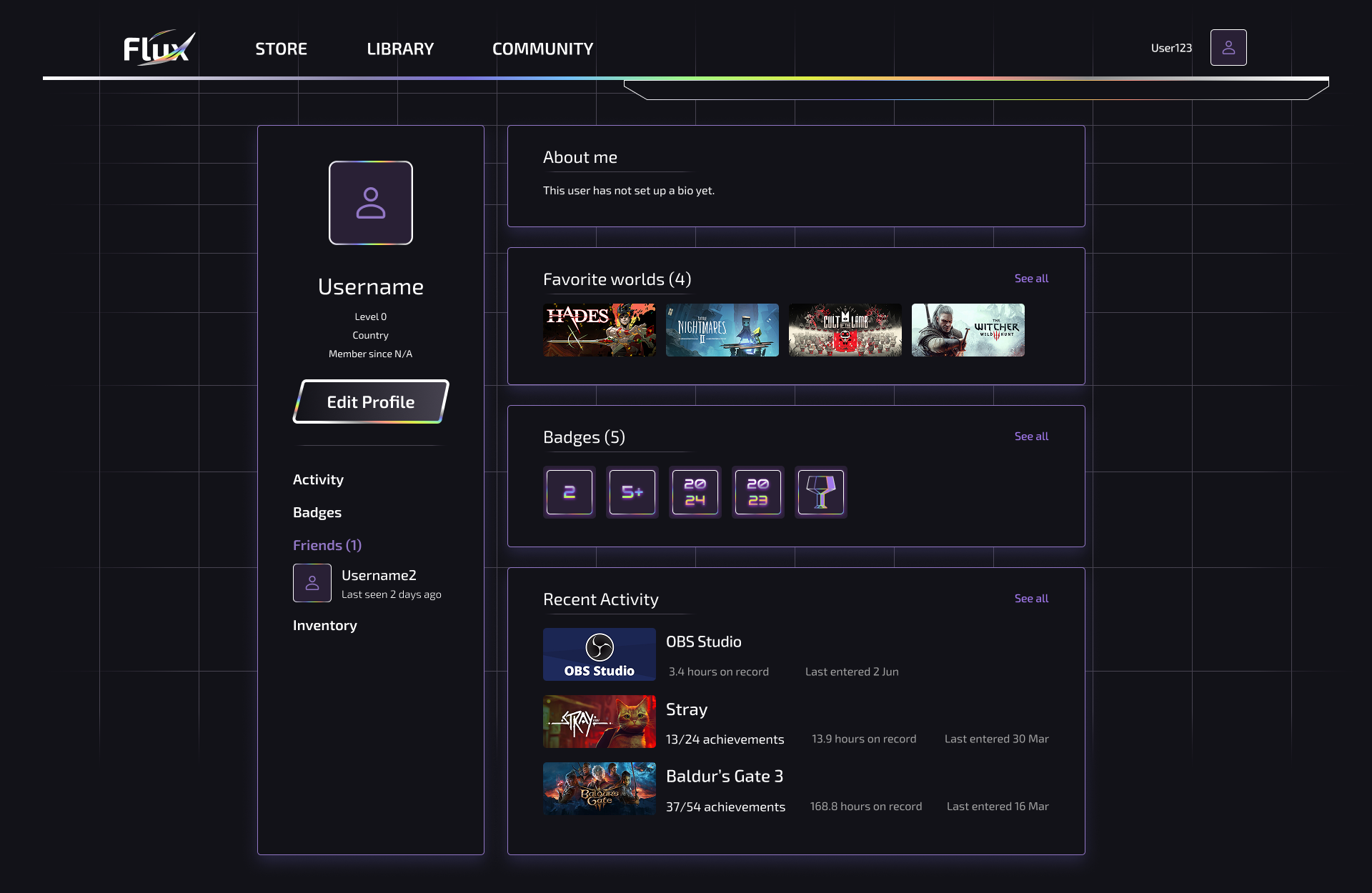
Flux (Steam clone)
Reimagining Steam as a platform that feels like a friend, not a puzzle.
Overview
Solo designer on a full-scale Steam concept redesign. I owned the project end-to-end: research, information architecture, design system, 40+ desktop screens, 15 mobile screens, and Figma animation — defended with distinction.
Problem
Steam retains users through library lock-in, not experience quality. The interface is cluttered, key features are effectively invisible, and the marketplace intimidates users into avoiding it entirely.
Research
Interviewed 4 users and conducted a deep platform audit. Key discovery: Steam's Collections feature — useful, completely hidden, and unknown to most users I spoke with. This became a core design principle: useful features should never require accidental discovery. Additional pain points: overwhelming marketplace flow, repetitive homepage with no hierarchy, friction-heavy checkout.
Key Decisions & Why
Collections redesigned from hidden to central — surfaced where users actually look, with clear visual language. Marketplace flow restructured into a streamlined step-by-step process. Sci-fi aesthetic applied through details — holographic gradient in logo, header and accent buttons — distinctive without alienating users during long sessions.
Results
· 40+ desktop + 15 mobile screens with full animation — delivered solo over 3 months
· All screens annotated for dev mode, approved by instructor
· Defended with distinction — noted for high autonomy throughout the process
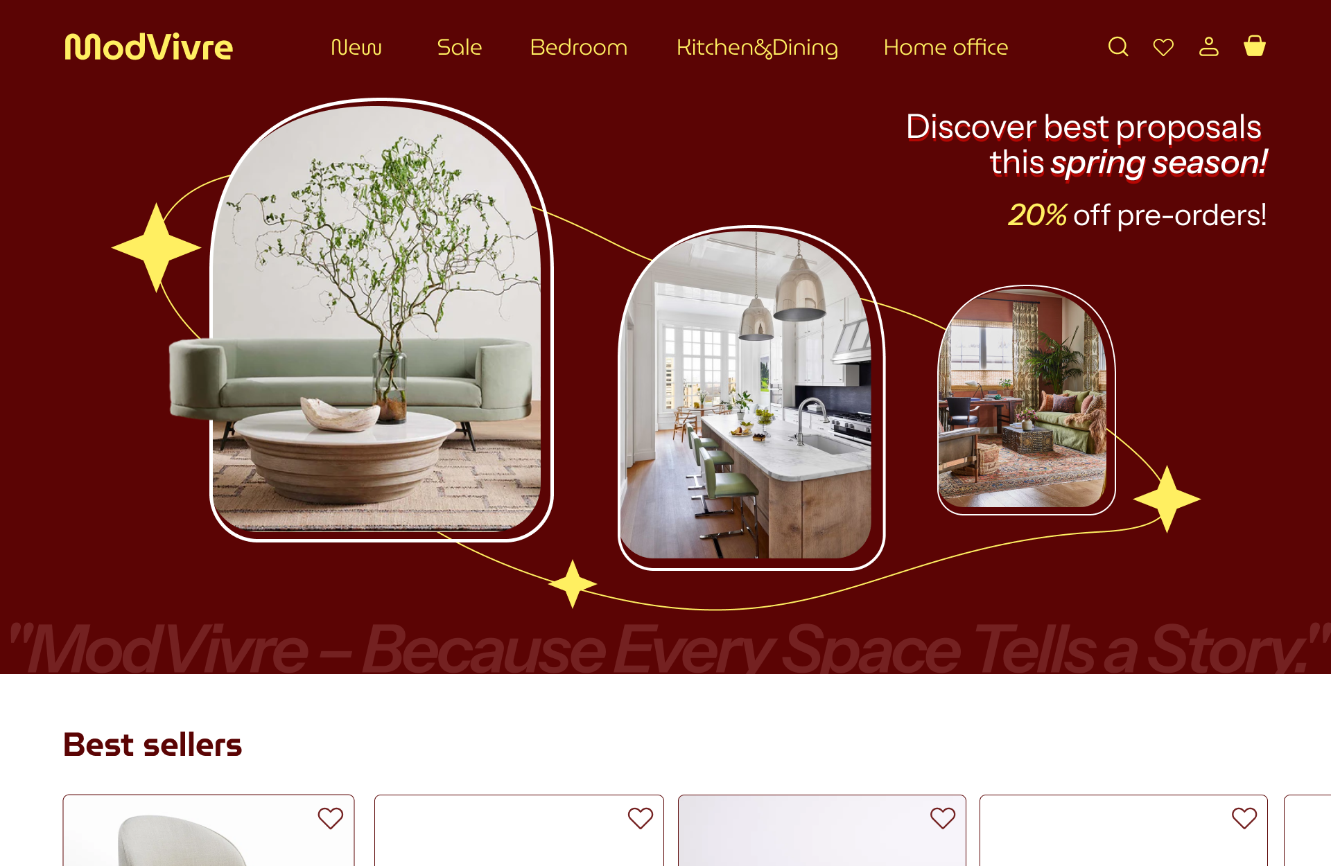
E-commerce
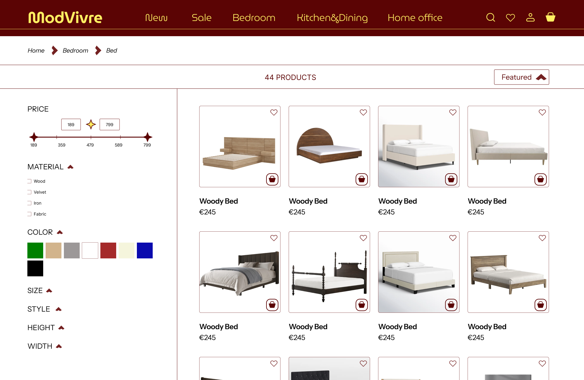
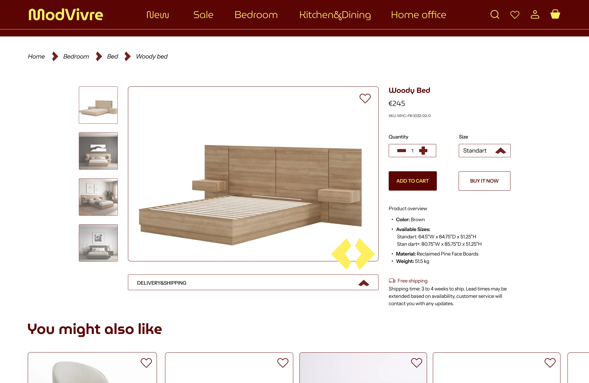
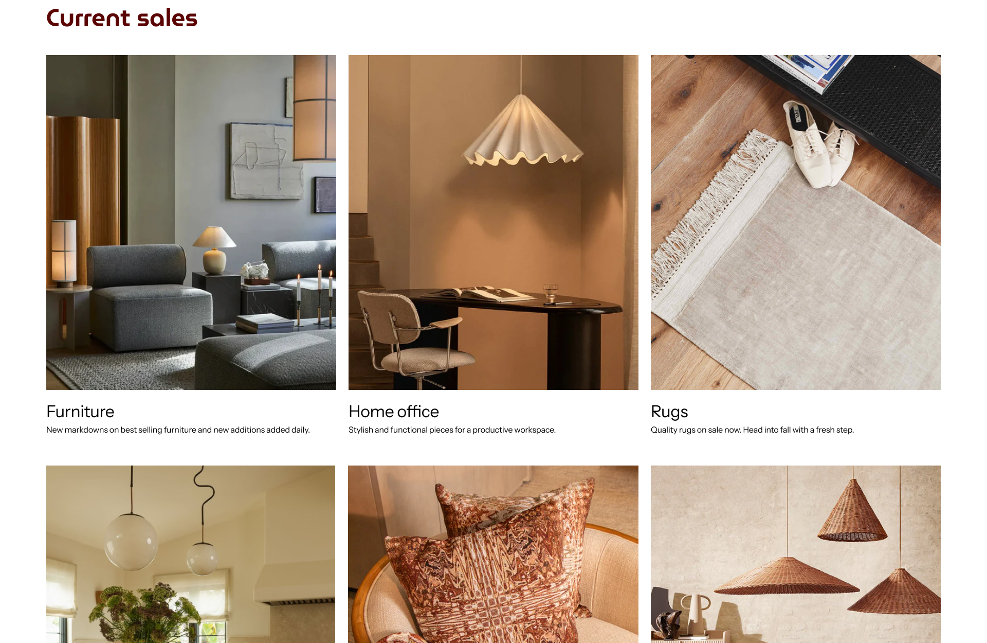
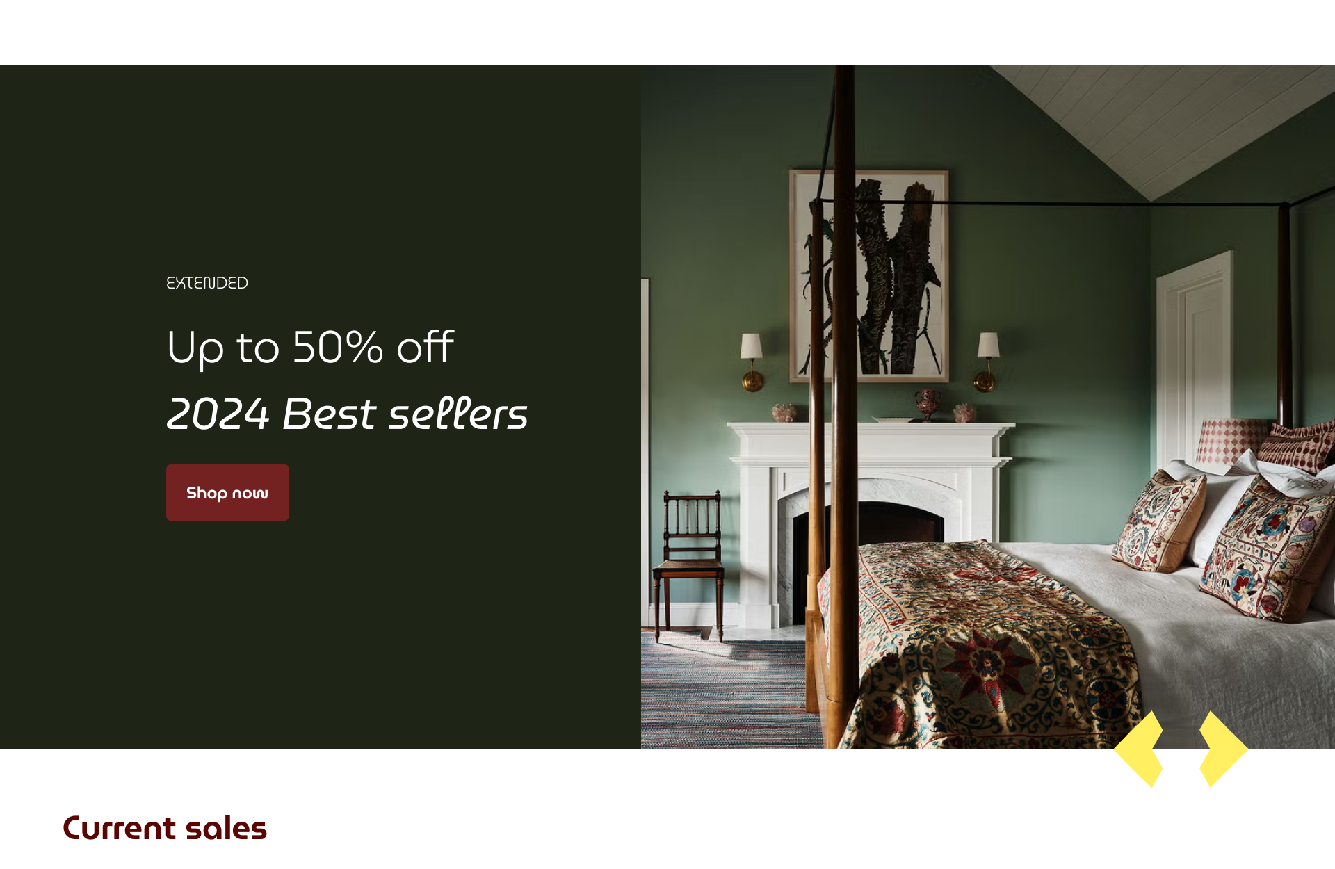
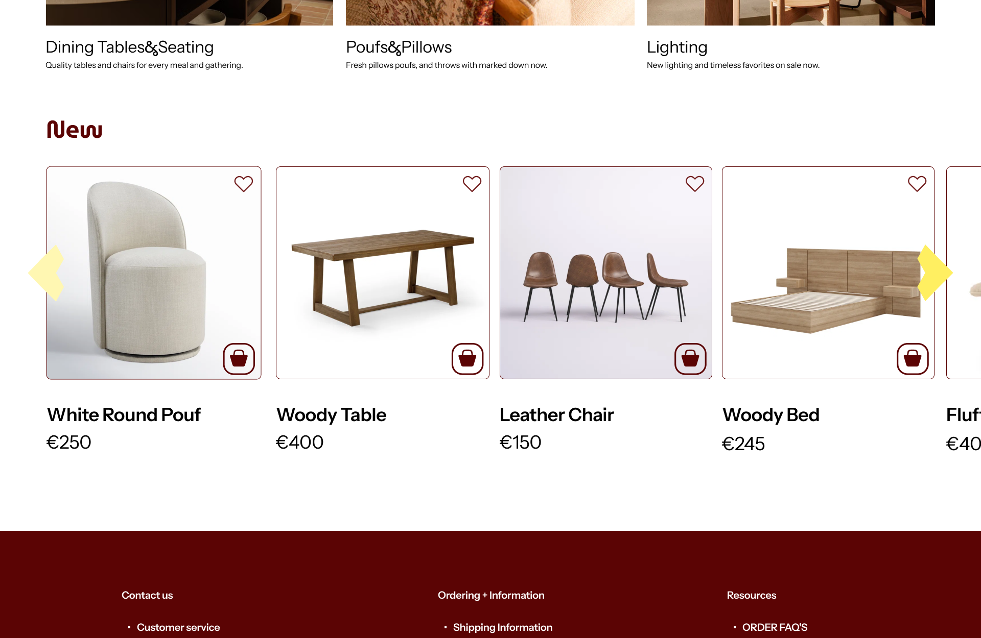
ModVivre (Furniture store)
A premium shopping experience that balances information, ease, and aesthetics — built solo from naming to prototype.
Overview
Self-initiated e-commerce concept for a premium furniture brand. I owned everything: naming, slogan, logo, design system, and full UX/UI across desktop and mobile — completed in 2 weeks alongside other active projects.
Problem
Competitive analysis of 4 furniture sites revealed the same pattern: grey palettes with no visual accent, overloaded homepages, and filter systems that discouraged use rather than helping. Premium in price, generic in experience.
ModVivre was built around one principle: give users everything they need to make a confident purchase — without making them work for it.
Research
Analysed 4 competitors across design quality, homepage structure, catalogue layout, product pages, and colour systems.
Key finding: information overload hurt navigation, but stripping content eroded trust.
The solution was hierarchy, not reduction. Moodboard initially pointed toward green — common in the furniture space. I changed course at the last moment: burgundy felt more original and genuinely premium. Green was safe. Burgundy was a statement.
Key Decisions & Why
Burgundy over green — every competitor defaulted to neutral palettes. Burgundy was chosen as a deliberate differentiator: warmer, richer, more ownable.
No reviews section — competitor sites showed empty "No reviews yet" blocks that undermined trust. For a premium brand, social media presence and influencer content build credibility more honestly than placeholder ratings.
Separate filter page on mobile — instead of compressing the desktop panel into a small sidebar, a dedicated full-screen filter page eliminated small touch targets and gave users space to browse comfortably.
Results
· Conceived and executed a complete brand identity and shopping experience solo: naming, slogan, logo, design system, and 7 screens — in 2 weeks
· Delivered a full component library with multiple interaction states
· Made 3 deliberate departures from industry convention — colour strategy, social proof approach, and mobile filter UX — each backed by competitive research
· Recognised by peers and instructors as visually distinct from existing market references